
The Container / Parent
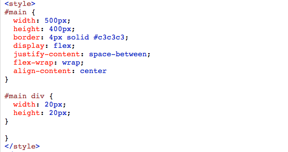
justify-content (positioning horizontal)
flex-start: (default) Items align to the left side of the container.flex-end: Items align to the right side of the container.center: Items align at the center of the container.space-between: Items display with equal spacing between them. (first and last item will be at the edge of the page)space-around: Items display with equal spacing around them. (first and last item will have space between it and the edge of the page)
align-items (positioning vertical)
align-items how the items as a whole are aligned within the container
flex-start: Items align to the top of the container.flex-end: Items align to the bottom of the container.center: Items align at the vertical center of the container.baseline: Items display at the baseline of the container.stretch: (default) Items are stretched to fit the container.
flex-direction
row: Items are placed the same as the text direction.row-reverse: Items are placed opposite to the text direction.column: Items are placed top to bottom.column-reverse: Items are placed bottom to top.
*** when flex-direction:column;
both the justify-content and align-items for flippedjustify-content changes to vertical
align-items changes to horizontal
flex-wrap
nowrap: Every item is fit to a single line.wrap: Items wrap around to additional lines.wrap-reverse: Items wrap around to additional lines in reverse.
flex-flow
Shorthand, combines both flex-direction and flex-wrap
flex-flow: row wrapalign-content (similar to align-items)
align-content determines the spacing between lines. Use in conjunction with flex-wrap, since it modifies the behavior of the flex-wrap property. Will override align-items if both are used.
*Includes 2 more properties not in align-items space-between and space-around.
flex-start: Lines are packed at the top of the container.flex-end: Lines are packed at the bottom of the container.center: Lines are packed at the vertical center of the container.space-between: Lines display with equal spacing between them.*space-around: Lines display with equal spacing around them.*stretch: Lines are stretched to fit the container.
Child of the Container
order(items in the container )
Takes in a whole number, negative or positive. Will display Pink, Red, Green, Blue.
#myRedDIV   {order: 2;}
#myBlueDIV  {order: 4;}
#myGreenDIV {order: 3;}
#myPinkDIV  {order: 1;}
align-self (same as align-items but only apply to ONE item)
flex-start: Items align to the top of the container.flex-end: Items align to the bottom of the container.center: Items align at the vertical center of the container.baseline: Items display at the baseline of the container.stretch: (default) Items are stretched to fit the container.
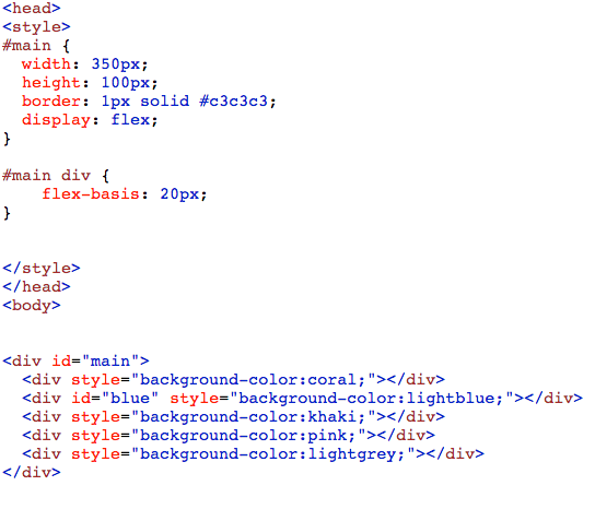
flex-basis(items in the container)
The flex-basis property specifies the initial length of a flexible item. The default size of the item before any allocation of the available spacing.
#main div {
  flex-basis: 50px;
}
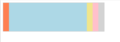
flex-grow (a child or item of the container)
Will take up the available empty space in the container. The number can only be positive.
A number specifying how much the item will grow relative to the rest of the flexible items. Default value is 0
#blue{
 flex-grow: 4
}


flex-shrink (a child or item of the container)
Will shrink an item and reallocate the remaining equally to the other items.
The flex-shrink property specifies how the item will shrink relative to the rest of the flexible items inside the same container. Default value 0.
#blue{
 flex-shrink: 4
}


